Day 19
Today the Diva announced the winners of the contest that was part of the 200th challenge celebration. I was in shock when I got an email from her yesterday that I was one of the winners!!! I am so excited. I rarely win anything, and to win a contest with a Diva challenge... a Zentangle challenge... well I just can't believe it. You can see more of the challenge (over 200 participants!) please visit her website at I am the Diva blog
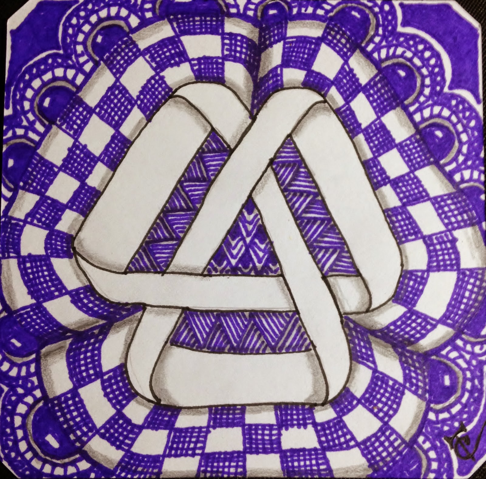
Challenge 201, this weeks challenge is to design a tile using the Moebius Syndrome Foundation's logo as our string in honor of Moebius Syndrome awareness. This is mine:
And this is Day 19 from my tangle*a*day calendar, using the patterns Beeline, Cubine, and Rain.
Thank you to all who stop by, and to those who leave comments. The comments are very encouraging and help keep me motivated.


Your logo sort of jumps out of the tile, that's great!
ReplyDeleteThank you, Ilse. I'm really trying to work on my shading. I even bought a book to help me. It just arrived yesterday.
DeleteWhat a beautiful, 3D, purple background you provided for the moebius symbol. Very nice.
ReplyDeleteThank you, Suzanne. I'm really trying to work on my shading, to get that 3D effect! I'm having fun with it and can't wait to see what thing will look like once I start learning from the new shading book that I got yesterday
DeletePretty!
ReplyDeleteThank you, Duchess.
DeleteStunning Cat....stunning!
ReplyDeleteThank you, Chrissie.
DeleteLovely tile with a fine 3D effect!
ReplyDeleteThank you LonettA
DeleteLove it! The ribbon really pops!
ReplyDeleteThank you Quinn B
DeleteCongratulations on winning one of the prize packages. I have been fortunate recently to win on Genevieve Crabbe's blog on the Weekly Roundup. Nice touch to put the tangles around the logo and have it as the negative space. Really does make it stand out.
ReplyDeleteThank you, Donald. I appreciate your kind words! It's encouragement from people like you that keep untrained tanglers like me motivated.
DeleteCongratulations!!!! Your tile is beautiful, like Donald I like the tangles around the logo.
ReplyDeleteThank you Anne!
DeleteLove the white, but I am in love with your background of blue and white. Definitely looks like a pieces of fabric the way you drew it to look draped. Truly beautiful!
ReplyDeleteThank you Lynell. I didn't think about that.. but it does kind of look like puffs of fabric!
DeleteI like the way you tangled around the logo.
ReplyDeleteThank you! I appreciate the kind words! I hope you will visit again.
Delete